For your club
A small edition featuring art and your club’s mark. Tell us the occasion and roughly how many people it’s for.
Ask about a club edition ↗
Berlin · Art × club culture × everyday life
We’re developing small pocket ashtrays with art from Berlin. For club nights, celebrations and the way home. The designs are here – next comes testing materials, printing and everyday use.
Talk about a club edition ↗Explore the designs ↓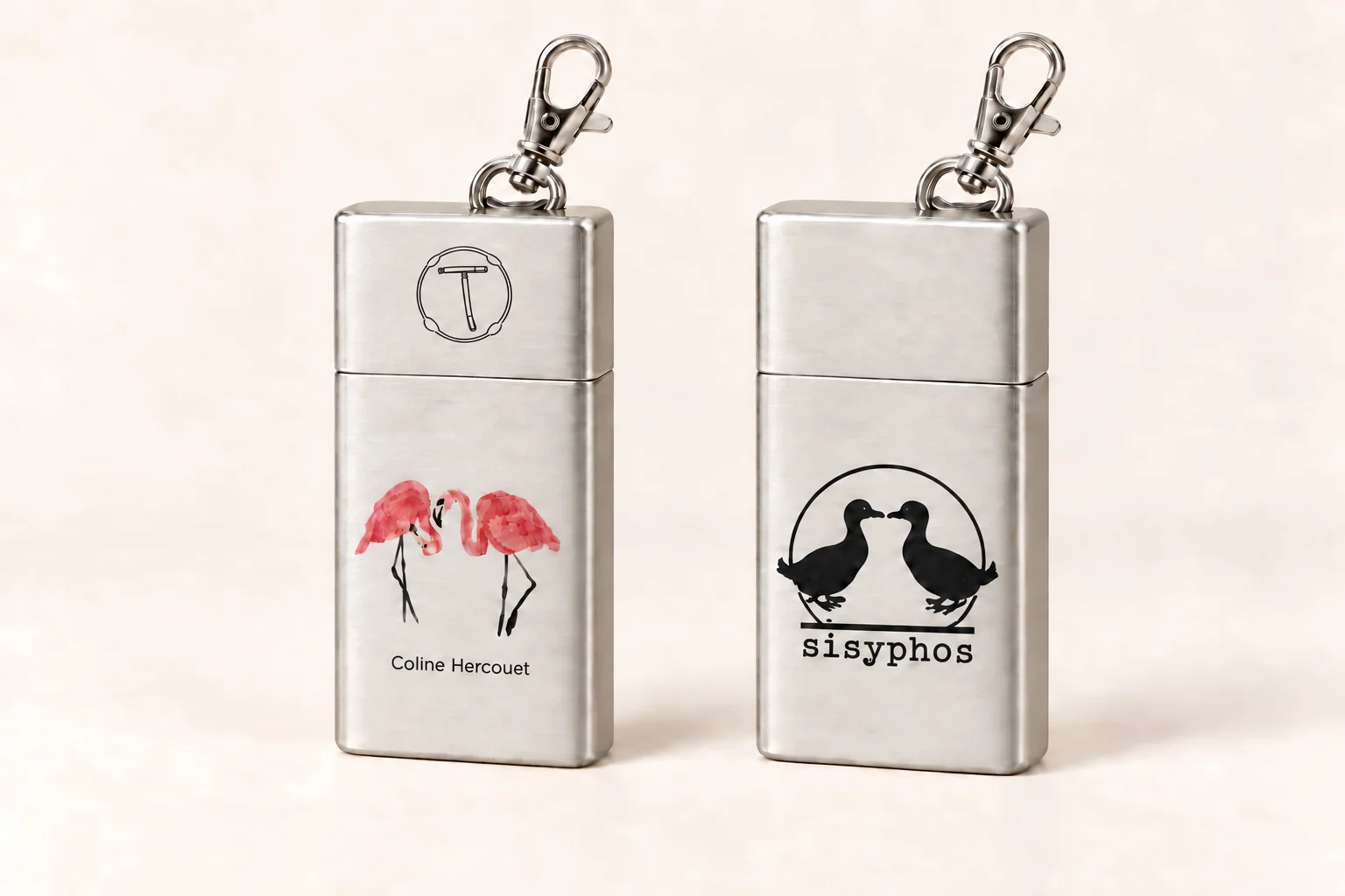
Still a concept. Let’s talk about it. The club pairings are proposals. Partnerships, usage agreements and print approvals are still to be agreed.
A small edition featuring art and your club’s mark. Tell us the occasion and roughly how many people it’s for.
Ask about a club edition ↗A wedding, birthday or special night: let’s work out which artwork and quantity fit.
Talk about your event ↗An adult smoker based in Berlin? Help us find out what’s worth carrying and what works day to day.
Join the product test ↗What it’s about
Your cigarette is out, but the nearest ashtray is far away. That’s where taschenbecher comes in: keep the remains with you and dispose of them properly later.
A bit of your favourite club to take along. Its logo on the back, with an edition developed together.
The artwork comes from artists we know. Their names go on the ashtray. We agree on use and any changes together.
The editions / Proposals
Four clubs, four initial pairings. We looked at each club’s identity and matched it with work from our artwork pool. These are starting points for a conversation with the artists and clubs. The images show art on the front and the club logo on the back; they are AI visualisations.
One more track, then out onto Kotti. The figure with a hat fits that kind of night for us: a bit odd, direct and hard to miss. A small companion that might get people talking.
The figure with a hat shares a similar graphic language: a direct gaze, bold dark shapes and a memorable character. We see a little night-time companion in it. The figure’s precise meaning remains Coline’s to define.
Paloma’s drawn dove and hand-drawn lettering have personality and strong black-and-white contrast. The club at Kotti pairs this distinctive graphic identity with music, merchandise and its own label.
Black and white on cork require a suitable print process. A black-only, one-colour version would need separate agreement.
To discuss with the clubDoes this character feel like Paloma to you?
A quick break outside, meet someone, move on. That’s what the two flamingos bring to mind. There’s also a connection to the two Sisyphos ducks, without redrawing their logo.
Two flamingos face each other: a clear connection to the duck-pair composition, with their own watercolour language and soft pink shapes. The pair tells a story of meeting without copying the club emblem.
The two ducks are part of Sisyphos’s visual world. Dance, art, performance and the large outdoor area form the cultural setting. The current website features a flag installation in warm tones.
Colour printing preferred. A one-colour version would need its own treatment agreed with Coline.
To discuss with the clubCould this playful kinship with your ducks work as a guest-art proposal?
Taking a crustacean for a walk? In Coline’s drawing it looks completely normal. That dry humour feels right for Renate to us: a little theatrical, a little odd, with room for your own story.
A person walks a large crustacean on a leash, treating the unusual as perfectly normal. For us, that quiet surreal humour suits a place where people can play with roles, imagination and self-expression.
Renate’s identity combines narrow lettering, rectangular lines and violet accents. Its 2026 presentation emphasises experimentation, local creatives and a playful, theatrical character, with studios and live programmes making room for art.
Colour printing preferred. The fine leash must remain visible at actual print size.
To discuss with the clubDoes this surreal humour capture Renate’s character today?
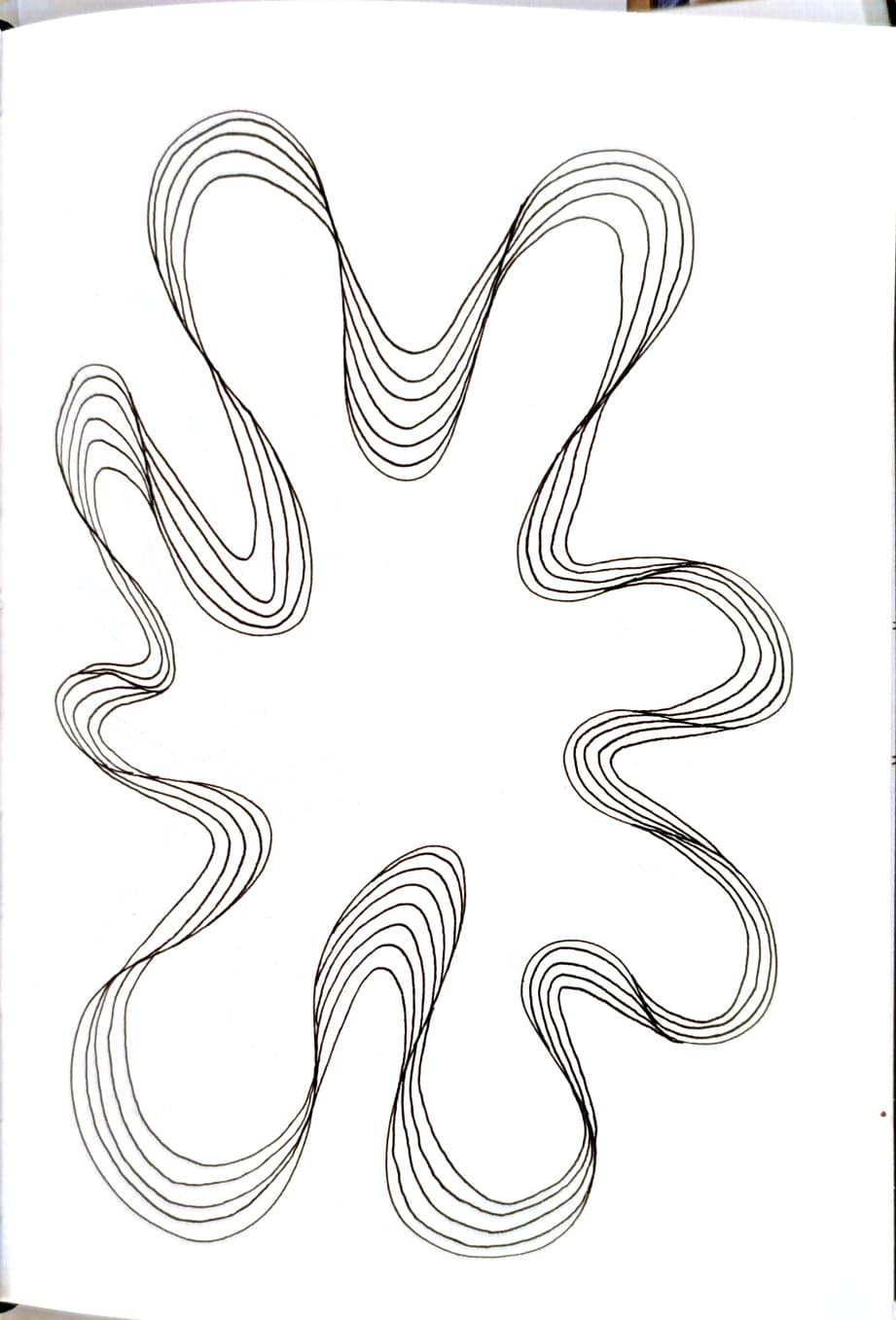
The lines repeat, but never quite the same way. They remind us of a good groove. It feels like a natural idea for Heideglühen; we want to ask the club whether they see it that way too.
Parallel lines repeat a movement, each slightly different. We read it as visible groove. The contours connect formally with the club’s lettering and bicycle graphic. It remains an abstract artistic interpretation.
Violet, light outlines and a bicycle drawing shape the current website. The September 2026 preview includes daytime starts and long weekenders; Tagesspiegel’s club profile describes house and disco as musical focal points.
A one-colour candidate with fine lines. Agree the colour and any edits with the artist.
To discuss with the clubDoes recognition come more from colour, lettering or the rhythmic shape for you?
The surface makes a difference
On a smooth surface, colours and lines stand on their own. Cork adds its own texture. Here are Coline’s flamingos on both versions, with the same brand and artist credit.
The silver concept offers a calm background for fine lines and colours. We’ll check weight, size and everyday carrying with physical samples.
The proposed surface is cork, not a printed cork pattern. This flat pouch is our second direction. We’ll check its material construction and finish on a physical sample.
The critical question from the feedback: will the cork crumble, peel at the folds or wear away? This has not been validated. We’ll inspect the construction, edges, seams, fastening and print on real samples and test everyday carrying. The visualisations show the design only; they do not prove durability.
Our plan for the first test ↓The plan: 10–15 adult testers from our Berlin circle. Each person tries cork and metal for seven days each – 14 days in total. The start depends on when the samples arrive.
Source comparable models and manufacturer instructions. Agree on artwork, credits, print areas, costs and rights.
Some testers start with cork, others with metal. Switch after seven days. Record carrying, use, handling and defects separately.
What actually came along? What got in the way? Compare photos and feedback. Stop using defective samples; a short trial cannot prove long-term durability.
Set the small batch after choosing the material, receiving a quote and obtaining approvals. Artwork allocation and ordering remain open until then. Any event quantity is agreed separately.
A new question for the pilot
Feedback from someone we know: with another cork pouch, the cigarette had to be completely extinguished before insertion, so the user switched to metal. This is a clue for our test; the handling of our specific model still needs checking.
We’ll compare a flat cork pouch with a metal pocket ashtray that is as compact as possible. The same adult testers will try both in alternating order. We’ll ask about actual carrying, extinguishing, space, weight, smell, emptying and willingness to pay. For cork we’ll also document edge wear, folds, seams and print adhesion before and after use. Whether metal works as a premium option remains open.
Before use: For each sample, check the manufacturer’s instructions and whether it is suitable for extinguishing cigarettes or holding embers. An aluminium lining alone does not establish this. Until confirmed, put in only fully extinguished, cooled remains. The pilot does not test ember resistance.
OPEN · VALIDATE WITH SAMPLES AND IN THE MARKET
Our hypothesis: The cork pouch stays intact with regular carrying and people like using it. We don’t yet know whether that is true or whether people prefer it to metal.
Decision after testing: Crumbling, peeling, open seams, leakage or unreliable fastening count against that version. We would then investigate a different construction or metal before settling on a production run. No visible damage after one week is an early signal, not proof of long-term durability.
We’ll record results through photos, usage notes and reasons for choosing a material. Any defective sample will be taken out of use.
The people behind the artwork
Coline, Chloe and Juliette. These are their confirmed works and the stories they’ve shared with us.
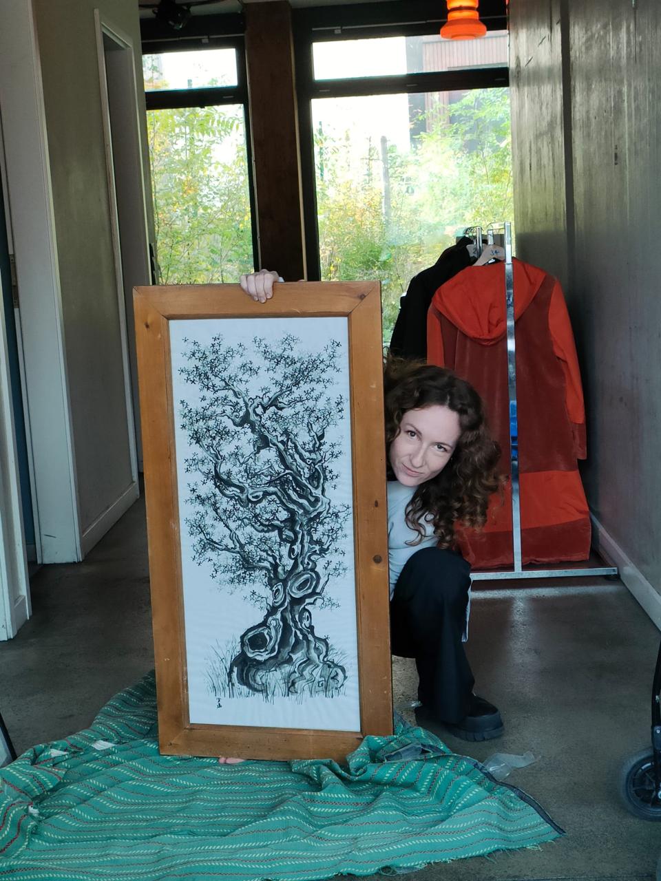
Coline Hercouët · Photo supplied by the artist for her profile
Ink, paper, movement · Berlin
Coline Hercouët is a French artist based in Berlin. Drawing from both Asian influences and her Breton roots, she explores imaginary landscapes through ink, where nature, movement and gesture come together.
Her monochromatic and minimalist works move between reality and fiction, leaving room for interpretation.
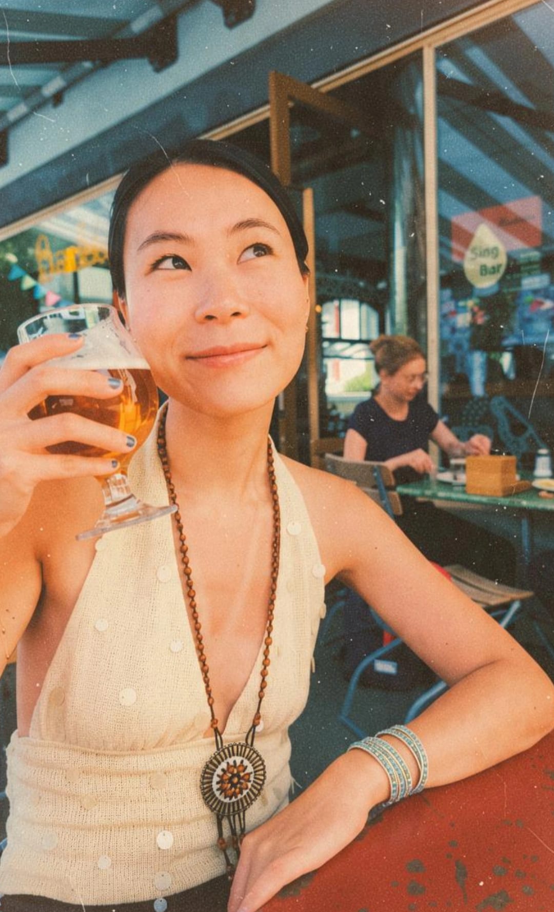
c. · Chloe
Painting & DJing · Berlin
Originally from China, Chloe now lives in Berlin. After leaving a white-collar job, she moved here to make room for a fresh start. Today she combines her studies with painting and DJing.
Over the past two years, she has shared her paintings at events and played occasional DJ sets at venues around the city. Art and music are ways to connect with people and explore where she wants to go next.
“I moved here to reimagine my life and explore new possibilities.”
From Chloe’s personal introduction
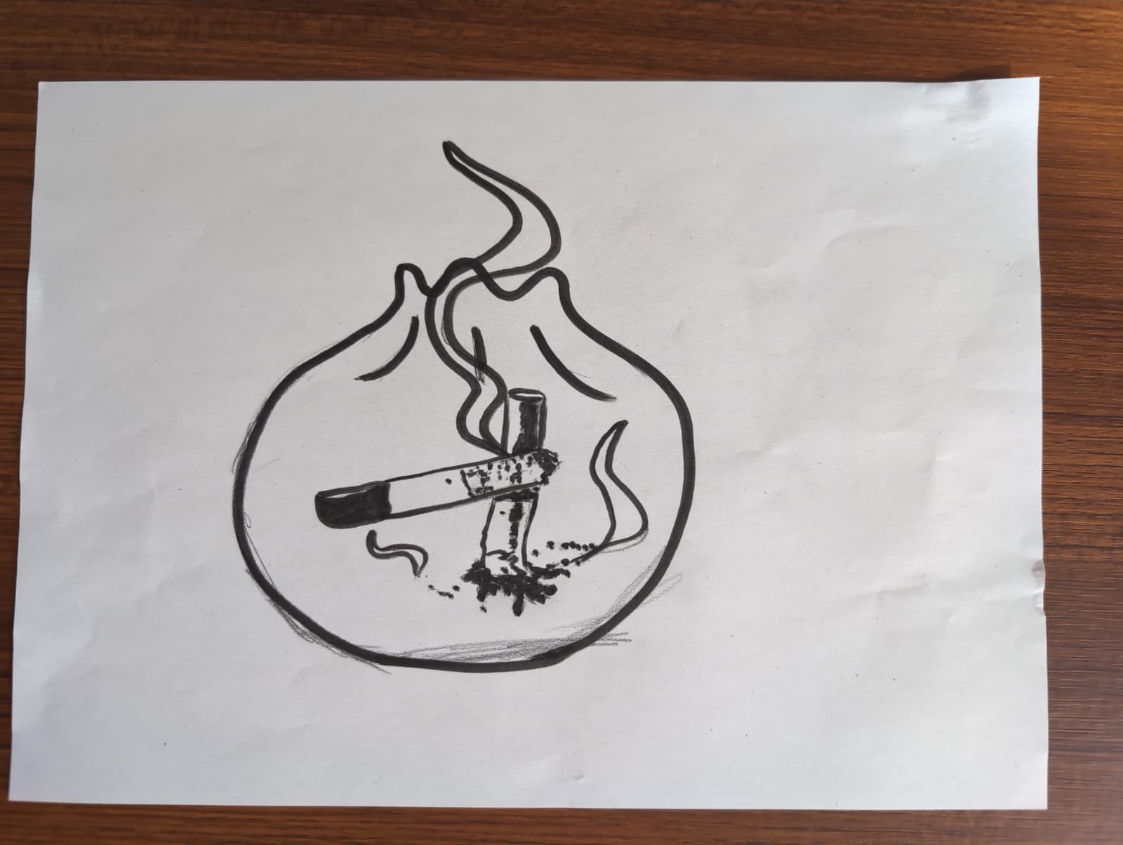
The dumpling/gyoza artwork is also by Chloe. Here is her original drawing and the concept for a Renate edition.
With camera and pencil
Photography & drawing
Juliette has always been passionate about the visual arts; she started drawing when she was little and gradually turned to photography.
Today, photography is her primary medium, but she still enjoys returning to her pencils. She draws inspiration from the fleeting nature of everyday life.
These profiles draw on the artists’ personal introductions and Coline’s artbook. Coline’s bio and profile photo were supplied through Eren on 7 October, and Juliette’s bio on 11 October. Updated 11 October 2026.
A club, a celebration or an interest in testing? A few lines are enough to start. We’ll get back to you and work out the next step together.
Want to bring your art to the project? ↗We discuss the occasion and quantity, agree on artwork, artist payment and usage rights, and check a physical sample. A specific quote and your approval come next. Pricing and delivery dates depend on the supplier’s confirmed offer.
New idea · Weddings & special occasions
Your own artwork, a date, a reminder of a good night. We are also exploring taschenbecher as a small favour for guests who smoke, at weddings and other celebrations.
An artwork that feels like you. A shared story, a small drawing or your initials. Art on the front; names and a date on the back if you like.
A small run for your friends. An artwork made for the occasion that people will still enjoy carrying afterwards.
An edition for an exhibition, a collective or a special party. Created with the artist, whose credit stays visible.
The front keeps the small taschenbecher symbol, the artwork and the artist’s name. The back can carry the occasion. Cork or metal, print space and colours are decisions to check on a sample.
We would begin with one event. Quantity depends on actual need and the supplier’s confirmed minimum order. Materials, printing and delivery need to be checked first. Cork durability remains an open test question.
Discuss the date, style, number of guests who smoke and budget. Start with one shared artwork for the whole run.
Agree on the artwork and its use with the artist. Confirm print area, quotation and delivery date with the supplier, then check a sample.
Offer the ashtrays in the smoking area with a short explanation. Afterwards, ask: Was it used, taken home and used again?
This is a new concept. Prices, minimum quantities and lead times are not yet confirmed.
Tell us about your event ↗The full artwork pool
Here are the other drawings from the project. Together with the four editions above, they include all ten of Coline’s motifs and the four individual drawings. The club pairings are suggestions. The artists speak for the original meaning of their work.
10 alternatives
Alternative for Paloma
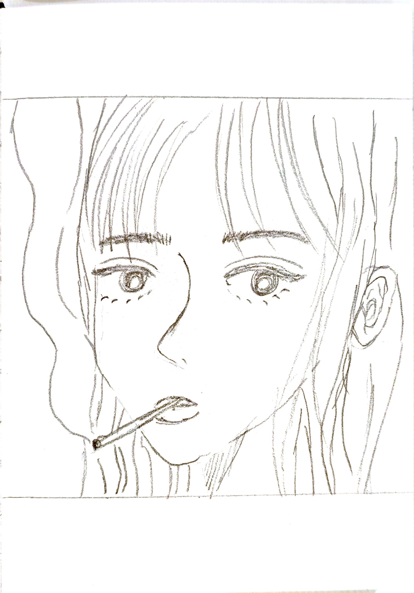
A brief moment outside the door. Juliette’s portrait is quiet and direct. For Paloma, it offers an alternative to the figure with a hat: less playful, more personal.
The spare drawing and direct gaze suit Paloma’s distinctive, hand-drawn visual world. The face offers a quieter note than the figure with a hat.
View the original drawing ↗Alternative for Heideglühen
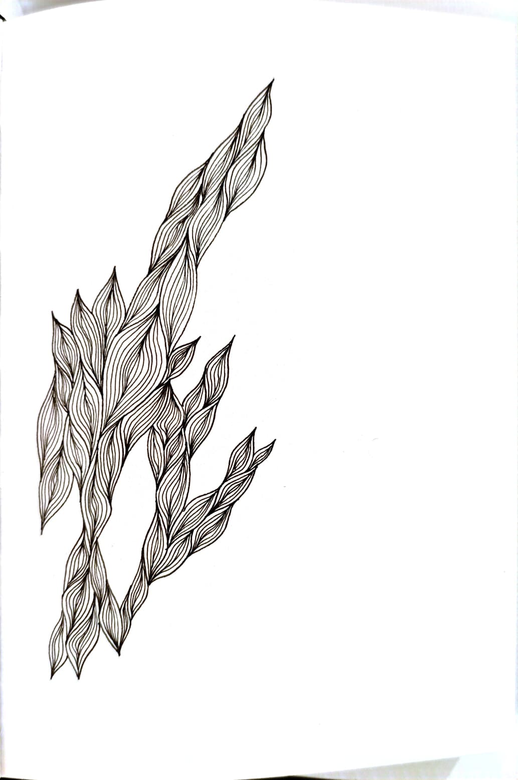
Lines crossing and coming together again. They make us think of a full dance floor. The tall shape could work well on a slim metal ashtray.
The organic weave combines repetition with small variations. It complements the musical reading of the rounded groove drawing and the outlines of the club’s identity.
View the original drawing ↗Alternative for Renate
A smoking dumpling. It doesn’t need much explaining. Chloe’s drawing brings the humour; we think it could make a good guest at Renate.
The unexpected everyday object and bold drawing suit Renate’s playful, theatrical character in our eyes. The dumpling takes the lead; the club emblem stays on the back.
View the original drawing ↗Alternative for Renate
Dark shapes move around a red centre. You recognise animals, lose sight of them and discover something new. We see a little night of changing roles and unexpected encounters.
The fragmented, surreal animal world gives Renate a more abstract alternative to the walk. The red circle holds the restless scene together.
View the original drawing ↗Alternative for Paloma
The record keeps spinning. A red centre, black figures in their own orbit, and suddenly another hour has passed. Our reading turns the small spiral into a memory of a night that went on longer.
The compact graphic and strong black-red contrast suit a music-related edition. The record connection is our story about the image, not a claim about its original subject.
View the original drawing ↗Alternative for Heideglühen
A dark stroke begins; a light one answers. Shapes slide together, then separate. For us, it’s a movement that echoes from the dance floor all the way home.
The alternation of strong and delicate ink shapes can be read as rhythm. A freer, more painterly alternative to Juliette’s clear parallel lines.
View the original drawing ↗Alternative for Heideglühen
The shapes return to the centre without becoming identical. Like a good loop in which each repetition reveals something different. A small image about keeping things turning.
The radial repetition fits the groove story. Compared with the tall weave, this version offers a compact, circular composition.
View the original drawing ↗Alternative for Sisyphos
Two quirky birds become a whole group. One turns around, another stands sideways, all part of the same scene. This edition tells our story of friends meeting again outside.
The bird family loosely echoes Sisyphos’s duck world. The taller, densely layered motif carries more group energy than the quiet flamingo pair.
View the original drawing ↗Alternative for Paloma
The figure leans sideways, as if spotting someone at the last moment. You were about to leave, then stay for one final track. That little sideways glance captures the moment.
Hat, gaze and strong black-and-white shapes stay close to the original Paloma idea. The sideways pose brings another movement to the same family of figures.
View the original drawing ↗Alternative for Sisyphos
Many pink figures move through the pattern. One is blue. It stands out and still belongs. We see a friendly little story about bringing your own rhythm.
Repetition, animal forms and a playful colour accent offer a free alternative to the flamingos. The club connection comes through our reading of encounters and individuality.
View the original drawing ↗The work behind the concepts
Coline’s overview shows the range of available designs. The club proposals use numbers 08, 06 and 10; the wave drawing comes from the wider project pool.
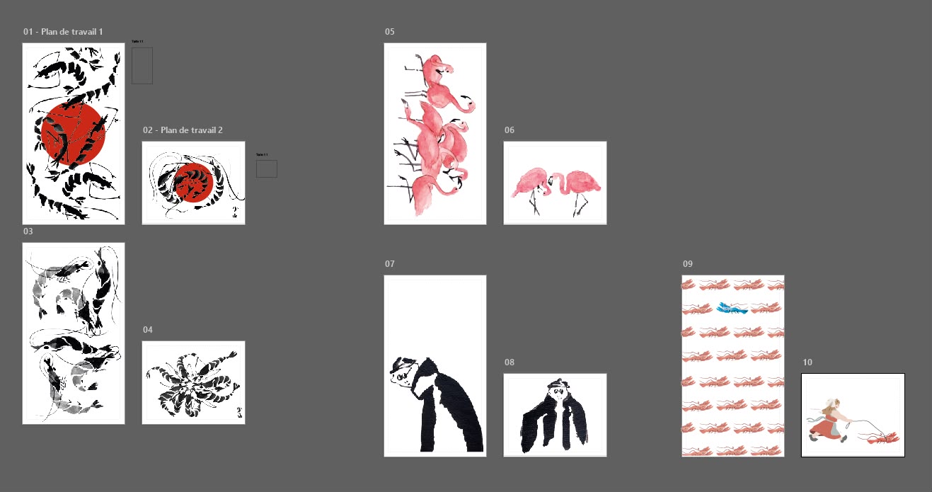
These works remain part of the selection. Dumpling: c. · Chloe. Groove drawing: Juliette Joly. The portrait of a woman smoking and the interwoven lines are also by Juliette Joly.
From artwork to ashtray
One of our two directions: a flat cork-surfaced pouch, around 8 × 8 × 1 cm, with an aluminium lining and snap closure, based on the linked product reference. The round symbol sits at the top of the front, with the artwork and a small artist credit below. The club logo goes on the back. These views show how the combination could look.
Product reference & print details ↗Heideglühen’s lines are a one-colour candidate. For Paloma, the visualisation has black and white areas; this needs an additional white print or an agreed single-colour version.
Colour is part of the flamingos and the walk. We’ll investigate colour printing or develop a separate single-colour version with Coline.
The product images are AI visualisations based on the drawings and club identities, not print files or finished samples. The linked cork reference currently lists one-sided, one-colour printing from 220 units. Two-sided, colour and white printing, usable print areas and our 50-unit run therefore need individual confirmation. Final artwork and original logo files will be approved together before the print proof.
The new symbol
Two cigarettes form a T, surrounded by the outline of a round ashtray. This drawing replaces the pocket symbol. The name stays taschenbecher – lowercase, with a gently slanted wordmark.

Only the symbol goes on the ashtrays. The art takes centre stage, with the artist’s name just below it. The wordmark stays on the website.
Before printing, we’ll check the fine lines at actual size. Real samples will show how well they hold up and stay legible on cork and metal.
Download the symbol as SVG ↗